Pharmacy Label Safety Checker
Understand Your Prescription Label
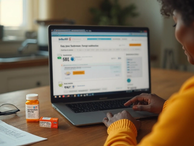
This tool helps you check if your prescription label meets safety standards and explains warning sticker meanings. Always read all label instructions before taking medication.
Label Check
Results & Guidance
Enter your label details to see if it meets safety standards and what warnings mean.
Key Safety Tips
- ✓ Always read the label's instructions word-for-word
- ✓ Ask your pharmacist about any unclear warnings
- ✓ Request a larger-print version if you can't read the label
- Never ignore warning stickers - they indicate serious risks
- ✓ Take a photo of the label for future reference
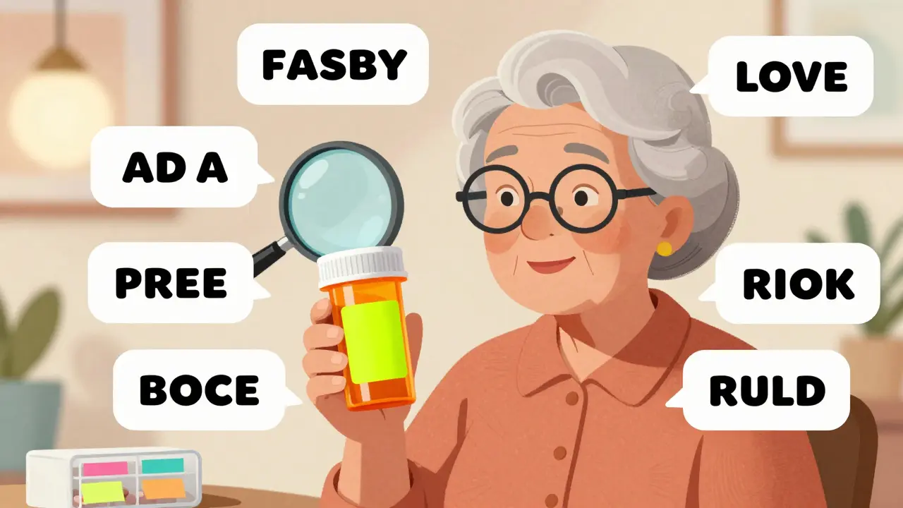
Every time you pick up a prescription, there’s a small piece of paper stuck to the bottle that could save your life. It’s not just a reminder to take your pills-it’s a safety net. But if you’ve ever stared at a pharmacy label and felt confused, you’re not alone. Many people, especially older adults and those managing multiple medications, struggle to understand what these labels really mean. The good news? There’s a big push to make them clearer-and you need to know how to read them right now.
What’s Actually on Your Prescription Label?
Your prescription label isn’t just a name and dosage. Federal law requires three basic things: your name, the drug’s name, and how to take it. But that’s just the start. Most labels also include the prescriber’s name, the pharmacy’s contact info, the fill date, expiration date, and a barcode. And then there are the warning stickers-those bright orange or red labels that say things like “CAUTION: OPIOID RISK OF OVERDOSE” or “DO NOT DRINK ALCOHOL.”
These aren’t random. In Connecticut, since January 2024, every opioid prescription must have a fluorescent orange warning sticker that’s exactly 1.25 inches in diameter. Other states are following suit. These stickers are designed to catch your eye-because if you miss them, you might miss a life-threatening risk.
Why Font Size and Color Matter More Than You Think
It’s not just what’s written-it’s how it’s written. The FDA and USP (United States Pharmacopeial Convention) now recommend using sans-serif fonts like Arial or Helvetica, with a minimum of 6-point size for basic info and 8-point or larger for warnings. Why? Because 68% of adults over 65 have trouble reading standard prescription labels, according to AARP’s 2023 survey. Small, thin, or light-colored text on a pale background? That’s a recipe for mistakes.
Contrast matters too. Text needs to stand out sharply against the background. Black on white? Perfect. Dark gray on light yellow? Not so much. Many pharmacies still use outdated labels that don’t meet these standards. If you can’t read it from arm’s length, ask the pharmacist for a larger-print version. They’re required to provide it.
The Barcode Isn’t Just for Scanning-It’s Your Safety Check
That square barcode on your label? It’s not just for the pharmacy’s computer. It contains your National Drug Code (NDC), lot number, and expiration date. Pharmacies scan it before giving you the medicine to make sure you’re getting the right drug, in the right dose, from the right batch. If the scanner beeps wrong, the system flags it. That’s a built-in safety layer.
But here’s the catch: if the barcode is smudged, faded, or printed poorly (below Grade C quality), it might not scan. That’s why some pharmacies now print labels with thicker ink and better alignment. If your label looks blurry or the barcode is peeling, ask for a new one. Don’t assume it’s fine just because it “looked okay.”
Warning Stickers: What the Colors Really Mean
Not all warning stickers are the same. Fluorescent orange is becoming the national standard for opioid risks-Connecticut made it law, and other states are moving toward it. Red usually means immediate danger: “DO NOT DRIVE,” “RISK OF FATAL RESPIRATORY DEPRESSION,” or “CONTRAINDICATED WITH ALCOHOL.” Yellow often signals caution: “MAY CAUSE DROWSINESS” or “USE WITH CAUTION IN KIDNEY DISEASE.”
But here’s the problem: there’s no nationwide rule on color meanings. One pharmacy might use red for all warnings. Another might use red only for the highest-risk alerts. That’s why you can’t rely on color alone. Always read the words. If a sticker says “CAUTION: OPIOID RISK OF OVERDOSE,” that means you’re at risk if you take more than prescribed, mix it with alcohol or sleeping pills, or use it longer than directed.
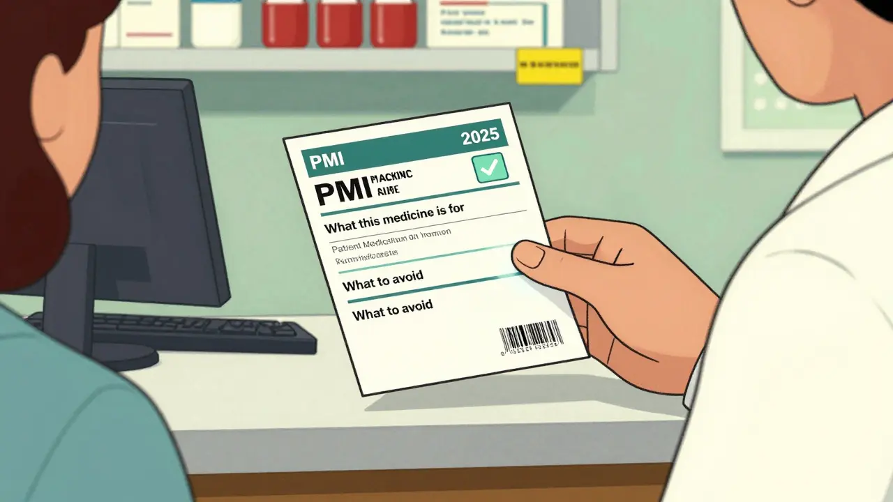
What the FDA Is Changing-And When
By January 1, 2025, every pharmacy in the U.S. will have to switch to a new format called the Patient Medication Information (PMI) label. This isn’t just a tweak-it’s a full redesign. Instead of scattered info, you’ll get a single, standardized page that looks like this:
- What this medicine is for (in plain language: “This medicine lowers your blood pressure”)
- How to take it (exact times, with or without food, what to do if you miss a dose)
- When to call your doctor (specific symptoms to watch for)
- Common side effects (not just “may cause nausea”-but “1 in 5 people feel nauseous”)
- What to avoid (alcohol, other meds, foods, activities)
This format is based on patient testing. In pilot studies, people understood the new labels 40% better than old ones. The FDA estimates this change could reduce medication errors by up to 30%. That’s thousands of preventable hospital visits every year.
Language Barriers and the Fight for Clearer Labels
One in five Americans speaks a language other than English at home. Yet, most prescription labels are only in English. California now requires pharmacies to provide Spanish, Chinese, Vietnamese, and Tagalog translations for common medications. Other states are watching closely. If you or a loved one struggles with English, ask for a translated label. Many pharmacies now have multilingual templates ready. If they don’t, ask them to print one from the FDA’s public resources-those are free and legally valid.
What You Can Do Right Now
You don’t have to wait for 2025 to get safer labels. Here’s what to do today:
- Read every word-even if it’s tiny. Don’t assume you know what “take once daily” means. Does that mean morning? Night? With food?
- Ask about the warning stickers-What do they mean? Why is this one here? Don’t let the pharmacist rush you.
- Request a larger-print version-It’s your right. Pharmacies have to provide it.
- Use a pill organizer with labels-Write the purpose and time in big letters. Color-code with sticky notes if needed.
- Take a photo of the label-Keep it in your phone. Share it with family members who help you manage meds.
Why This Matters More Than Ever
Medication errors are the third leading cause of death in the U.S.-and most come from misreading labels. A 2022 report from the Institute for Safe Medication Practices found that 12% of errors in community pharmacies were due to similar-looking labels or tiny print. One woman took her husband’s blood pressure pill instead of her diabetes pill because the labels looked almost identical. She ended up in the ER.
These aren’t rare mistakes. They’re systemic. And the fix is simple: clear labels, big text, consistent warnings, and patient education. The system is finally moving in that direction. But until every pharmacy switches to the new standard, you’re your own best defense.
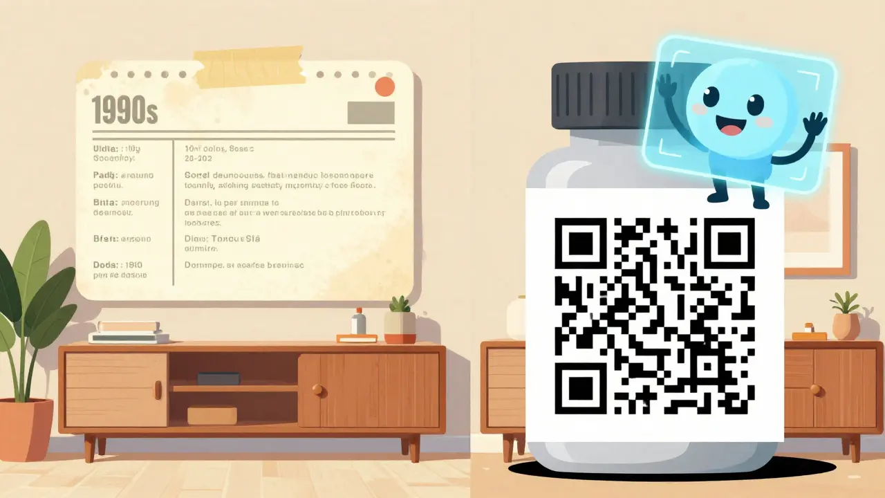
What’s Coming Next
By 2027, you might see QR codes on your prescription labels that link to short video instructions in your language. Some pharmacies are already testing this. Others are exploring augmented reality-point your phone at the bottle, and a virtual assistant explains how to take the pill. It sounds futuristic, but it’s already being piloted in 18% of prescriptions.
The goal isn’t to make labels fancy. It’s to make them foolproof. Because when you’re managing five pills a day, with side effects, interactions, and changing dosages, you shouldn’t have to be a detective just to stay safe.
Why are some pharmacy labels hard to read?
Many labels were designed decades ago without considering health literacy, aging eyes, or language barriers. Small fonts, low contrast, and cluttered layouts make them hard to read. The FDA and USP now require clearer standards, but not all pharmacies have updated yet. You have the right to ask for a larger-print or simplified version.
What does a fluorescent orange sticker mean?
In states like Connecticut, a fluorescent orange sticker means the medication is an opioid with high risk of overdose or addiction. Even if your state doesn’t require it yet, this color is becoming the national standard for high-risk drugs. Always read the text under the sticker-it tells you exactly what the risk is.
Can I get my prescription label in another language?
Yes. While not all pharmacies offer it automatically, federal guidelines support multilingual labels, and some states like California require them for common medications. Ask your pharmacist for a translated version. If they don’t have one, request they print it from the FDA’s public resources-those are free and legally acceptable.
What should I do if I don’t understand a warning on my label?
Don’t guess. Call the pharmacy or your doctor. Ask them to explain the warning in simple terms. Write it down. If the warning says “avoid alcohol,” ask if that means never, or just when taking the pill. If it says “may cause dizziness,” ask how soon after taking it. Clarifying now prevents emergencies later.
Are warning stickers required by law?
Federal law doesn’t require all warning stickers, but states can-and many do. Connecticut requires fluorescent orange stickers for opioids. Other states mandate warnings for blood thinners, sedatives, or drugs that interact with grapefruit. The FDA’s new PMI rule, effective in 2025, will require standardized safety warnings on every label, making stickers more consistent nationwide.


Ashley S
5 January 2026 - 20:19 PM
This is why I hate pharmacies-they act like we’re all geniuses who can read tiny print and decode jargon like it’s hieroglyphics. My grandma took her blood pressure pill instead of her diabetes pill because the labels looked the same. She ended up in the ER. Someone should’ve been paying attention.
Jeane Hendrix
5 January 2026 - 22:27 PM
So the FDA’s PMI label rollout is actually kinda huge? I didn’t realize they were standardizing everything into plain-language sections-what this med is for, how to take it, side effects with actual stats (1 in 5 people get nauseous??), and what to avoid. This is the kind of thing that could cut ER visits by a third. I’m just surprised it took this long. Also, the barcode thing? Genius. If it doesn’t scan right, the system should auto-flag it. Why aren’t all pharmacies doing this already?
Mukesh Pareek
7 January 2026 - 12:45 PM
Let’s be real-this isn’t about font size or color contrast. It’s about systemic neglect of health literacy. The entire pharmaceutical supply chain is engineered for efficiency, not comprehension. Opioid warning stickers? Cute. But if your label doesn’t include the half-life, CYP450 interactions, or renal clearance thresholds, you’re just putting a Band-Aid on a hemorrhage. And don’t get me started on the lack of pharmacogenomic data integration. This is performative safety. Real change requires genomic-aware labeling and AI-driven dosing advisories, not bigger Helvetica.
Tom Swinton
8 January 2026 - 15:30 PM
Okay, I just want to say-I read this whole thing, and I’m so proud of how far we’ve come! Seriously! The fact that Connecticut made orange stickers mandatory? That’s huge! And the FDA’s new PMI format? It’s not just a tweak-it’s a revolution! And the barcode? Oh my gosh, it’s not just for scanning-it’s a safety net! And the fact that you can ask for a larger-print label? You have a RIGHT to that! And the translations? Yes! Yes! Yes! And QR codes that play videos? That’s the future! And I just want to hug every pharmacist who takes the time to explain this stuff-because they’re heroes! And we all need to stop assuming we know what ‘take once daily’ means-it could be morning, it could be night, it could be with food, it could be on an empty stomach-so we need to ASK, and we need to WRITE IT DOWN, and we need to TAKE A PHOTO AND SHARE IT WITH OUR FAMILY, because no one should die because they misread a label!
Katelyn Slack
8 January 2026 - 16:39 PM
just wanted to say i asked for a bigger label last week and the pharmacist acted like i was being difficult. she said ‘it’s the same size as everyone else’s.’ but i’m 72 and i can’t read it. she finally gave me one after i showed her the aarp survey. thanks for reminding me i’m not crazy for asking.
Melanie Clark
9 January 2026 - 21:49 PM
They’re not trying to make labels clearer-they’re trying to control us. Orange stickers? QR codes? Video instructions? That’s surveillance disguised as safety. The FDA doesn’t care about your health-they care about liability. And don’t believe the ‘30% fewer errors’ claim-that’s pharma-funded propaganda. They want you to scan a barcode so they can track every pill you take. And translations? That’s just the first step to replacing English with globalist medical bureaucracy. Wake up. This isn’t progress-it’s control.
Tiffany Adjei - Opong
11 January 2026 - 08:02 AM
Okay but… what if the barcode is fine but the pharmacist misreads the script? I had a friend get the wrong antibiotic because the doctor’s handwriting looked like ‘amoxicillin’ but was actually ‘azithromycin’-and the barcode didn’t catch it because it was the same NDC code for both (yes, that’s a thing). So yeah, bigger fonts are nice, but if the system still relies on human input at every step, we’re just rearranging deck chairs. Also, why do we still use ‘take as directed’? That’s not a direction. That’s a cop-out.
Stuart Shield
12 January 2026 - 13:35 PM
Man, I’ve been a pharmacist for 22 years, and this article hits home. I’ve watched labels go from scrawled on sticky notes to barcoded, multilingual, color-coded nightmares. The real hero? The pharmacist who spends five extra minutes explaining a warning sticker instead of rushing to the next customer. We’re not robots-we’re the last line of defense. And yeah, the new PMI format? It’s beautiful. But it won’t matter if pharmacies still treat patients like numbers. So next time you get your script? Don’t just grab it. Ask. Wait. Read. And if the sticker says ‘CAUTION: OPIOID RISK OF OVERDOSE’? That’s not a suggestion. That’s a life-or-death whisper. Listen to it.